Published on:
June 3, 2026
Category:
Branding
FIFA's minimalist 2026 World Cup logo has caused a massive stir. Studio 34’s Design Team breaks down the system, the three-host culture, and how they pulled off a masterclass in modern identity.


FIFA's minimalist 2026 World Cup logo has caused a massive stir. Studio 34’s Design Team breaks down the system, the three-host culture, and how they pulled off a masterclass in modern identity.
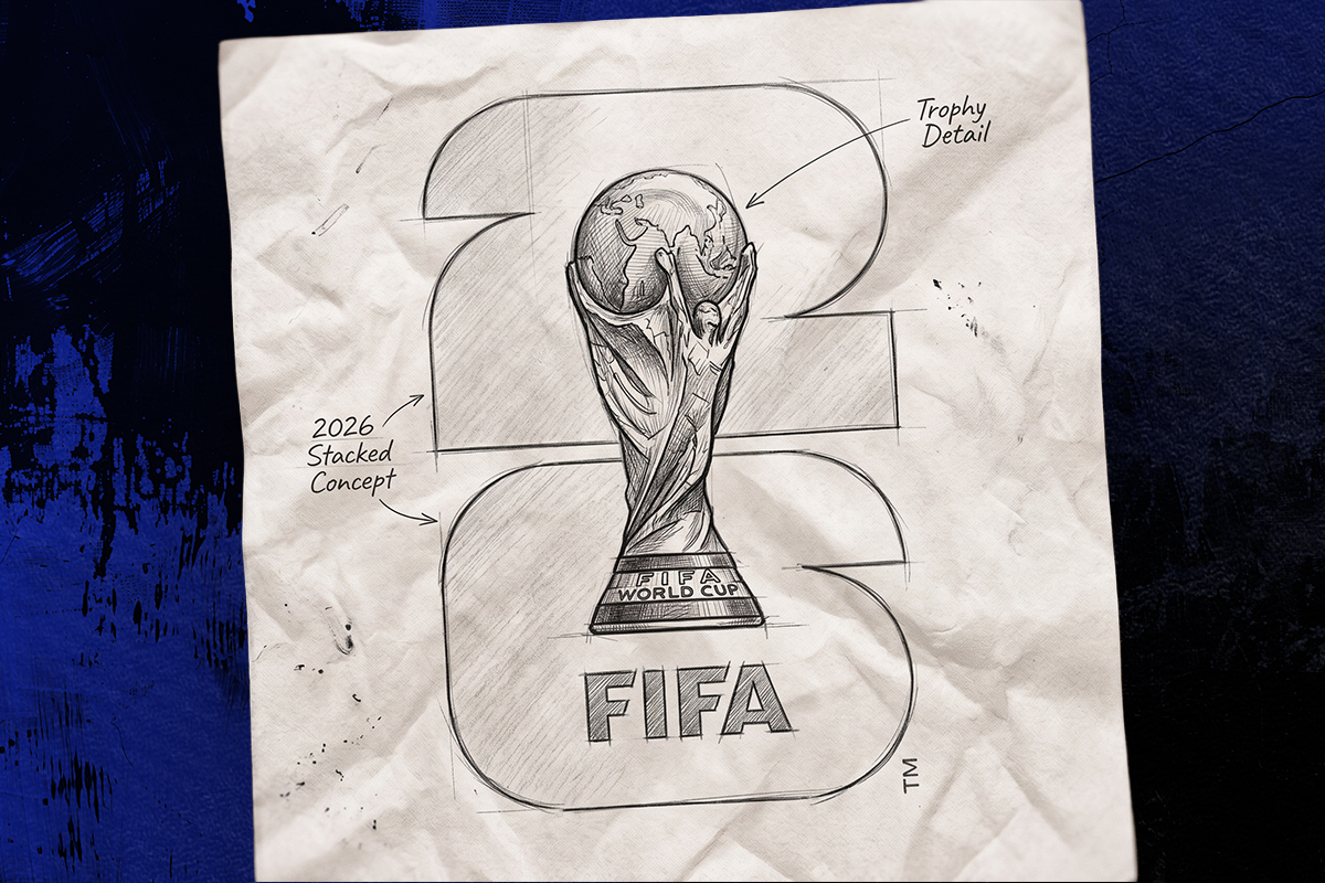
The design world is locked in a fierce debate over the visual identity for the FIFA World Cup 2026. For nearly a century, tournament logos were intricate, colourful tapestries woven to celebrate the unique folklore of a single host nation. The 2026 design completely breaks that rule. It features a bold, vertically stacked number "26" with a hyper-realistic photograph of the actual golden World Cup trophy sitting right on top of it.
While a static image of this logo might look incredibly simple at first glance, the full campaign rollout shows a brilliant strategy. FIFA faced a logistical puzzle that has never existed before in sports history. By looking at how the brand works across different cities, video screens, and merchandise, it is clear that the design team pulled off a major triumph. They created a living, breathing identity system built perfectly for the biggest tournament ever staged.
To understand why the design strategy is so unique, you have to look at the staggering scale of the 2026 tournament. It shatters every established boundary in football history:
Trying to create a traditional, illustrative logo that combined Canadian, Mexican, and American cultural symbols would have resulted in a messy, compromised design. Lean too heavily into one culture, and you instantly alienate the other two. To solve this, FIFA threw out the old playbook and designed an absolute masterpiece of efficiency and fairness.
The creative team opted for absolute universality. By removing flags, national colours, and traditional cultural icons, they focused entirely on the only two things every single fan on earth can agree on: the year ("26") and the ultimate prize (the trophy).
THE HISTORIC "TROPHY FIRST" APPROACH
For the first time in World Cup history, the logo features an unedited, hyper-realistic photograph of the actual solid-gold trophy instead of a flat vector drawing. This was a genius public relations move. Because the physical trophy belongs strictly to FIFA and is universally revered by all three nations, using its exact likeness acts as a total political neutraliser. No single country's heritage eclipses the others.
THE GEOMETRIC FRAMEWORK
The backdrop is a heavy, custom-designed geometric number "26" where the "2" sits directly on top of the "6". To support this, FIFA engineered a bespoke font family called "FWC 26". Featuring heavy architectural lines and sharp, clean cuts, the typography projects global authority and structure. This is tied together by the official multilingual slogan: "WE ARE 26" ("SOMOS 26" / "NOUS SOMMES 26"), creating a direct, confident message of continent-wide unity.
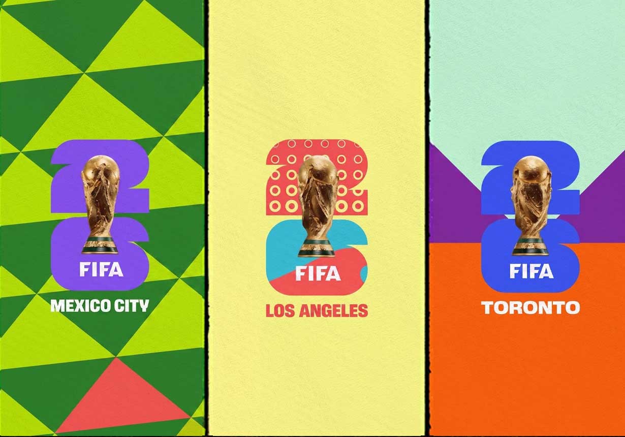
The real brilliance of the 2026 branding is that it isn’t just a single, rigid logo, it is a flexible framework designed to change depending on where it is used. FIFA created a master "parent" structure that remains uniform worldwide, but gave the 16 host cities their own "child" toolkits to express themselves: Boston uses a classic, historic East Coast colour palette; Mexico City bursts with vibrant, traditional festive hues; Seattle fills the design with deep Pacific Northwest greens and marine blues.
When you see the logo in motion on broadcast TV and digital platforms, the flat numbers actually hollow out and become a dynamic window device. The "26" shape fills with fast-cut video footage of local street culture, roaring stadium crowds, and city landmarks. The simplicity of the master logo serves as a quiet canvas, allowing the intense energy and distinct pride of each individual city to take centre stage.
Because the core logo is so structurally clean, it allows secondary physical merchandise and digital assets to truly pop with excitement:
THE PANINI ALBUM AND CARDS
On small digital apps and smartphone screens, the blocky "FWC 26" typography provides exceptional, crisp legibility. The 2026 Panini sticker collection and Adrenalyn XL cards take full advantage of this clean framing, surrounding it with futuristic neon gradients and high-contrast dark modes that build massive collector hype.
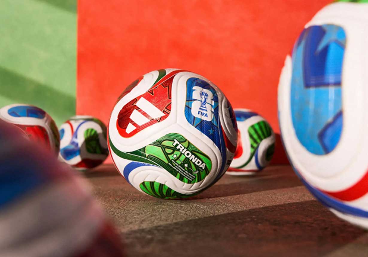
THE OFFICIAL MATCH BALL
Created by Adidas, the official 2026 match ball is named Trionda ("three waves"). Its design introduces beautiful, sweeping curves that visually contrast the hard, blocky lines of the logo, bringing a classic sense of fluid motion back to the pitch.
While the parent logo plays it safe with universal neutrality, FIFA used secondary assets to inject the raw soul and passion of the host nations back into the tournament. Instead of forcing one single mascot to awkwardly represent all of North America, they launched an energetic trio of characters, giving each country its own distinct football identity:
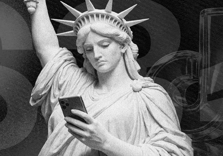
This brilliant commercial strategy lets each country retain pure ownership over its local merchandising while maintaining harmony across the continent. This localized pride is mirrored in the tournament's promotional posters, where local artists were commissioned to weave in famous regional landmarks, like the Statue of Liberty torch for New York or the Cerro de la Silla mountains for Monterrey.
Every major strategic design shift involves clear creative trade-offs. Here is the definitive assessment of how the 2026 system performs:
Unrivalled scalability
The flat, minimalist geometry is perfectly optimized for the digital age. It looks crisp and behaves flawlessly whether it's shrunken down to a tiny mobile screen icon, printed on a stadium ticket barcode, or animated across a 4K broadcast opening.
Flawless risk mitigation
By keeping the master mark neutral, FIFA successfully protected the brand from regional favoritism, cultural controversies, or political friction across the three nations.
Local commercial freedom
The parent-child architecture gives local marketing teams the power to make the tournament feel authentic to their specific fans without breaking global consistency.
Corporate emotional detachment
In its basic, static print form, the primary logo operates like an institutional trademark rather than an entertainment brand. It handles technical optimization perfectly, but it might lack the immediate, visceral hook that instantly builds fan excitement on a poster.
Absence of initial cultural soul
Because the parent framework plays it so safe to avoid favoritism, the standalone logo fails to instantly communicate the deep history, distinct rhythms, and raw passion of North American football, deferring all the storytelling to secondary assets.
Aesthetic disconnect in print
Placing a hyper-detailed, 3D photograph of the trophy over a flat, 2D geometric font creates a sharp visual contrast. When stationary, the elements do not blend into a single cohesive piece of art; they sit stacked on top of one another, which risks looking sterile compared to past tournaments.
The branding of the FIFA World Cup 2026 is a masterclass in modern execution, showing exactly what happens when you treat a visual identity as an adaptable, high-performance system rather than a static piece of print packaging. By turning the core logo into a dynamic viewport for local culture, the design team managed an unprecedented continental challenge and created a framework that will dominate screens worldwide.
The critical takeaway for any ambitious business is clear: do not streamline your identity so heavily that you erase your personality. The most successful global campaigns achieve scale not by diluting who they are, but by building robust parent foundations and pairing them with flexible, modular toolkits. This allows your brand to adapt seamlessly across different channels and local markets without ever breaking cohesion.
Our Purpose: We are driven to make ideas perform. At Studio 34, we reject clinical, rigid formulas that strip the soul out of your business. We combine sharp, data-driven strategy with intuitive human storytelling to ensure your brand doesn't just pass a digital responsiveness test, but truly cuts through the noise.